


On this page
Navigating the dashboard page
The current view version is the following:
You have the choice between
- the graph view (default when you log in)
- the table view
To switch between, view, use this little toggle button at the top right

The Graph view
You can see up to 6 accounts in graph view. If you have access to more than 6 different accounts, the top 6 (in number of lines) will be displayed in graph view.

Once you have selected a single account, only this account will appear in the dashboard
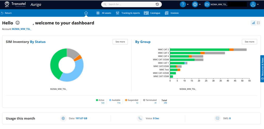
SIM Inventory graph
The donut chart shows the account’s lines by status.
you can:
- see the number of lines by hovering your cursor
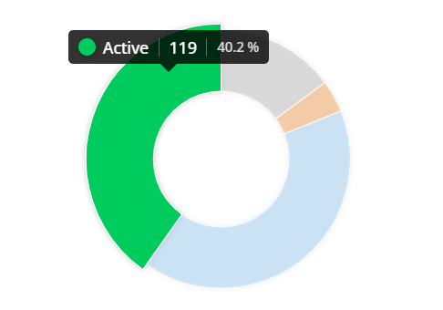
- click on a status to display the lines in this status
- click on “see more” to display all the lines (this is a shortcut to the “All Asset” menu)

Group graph
The histogram on the right shows your groups.
You can
- see the number of SIMs in each status by hovering your cursor
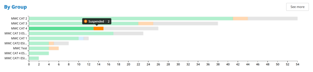
- click on the name of a group to display all the SIMs in this group
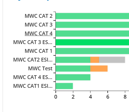
- click on “See more” to see all the groups (this is a shortcut to the Group menu)
Monthly Usage
At the bottom of the page, you can see the usage made by the SIMs of your account since the beginning of the month

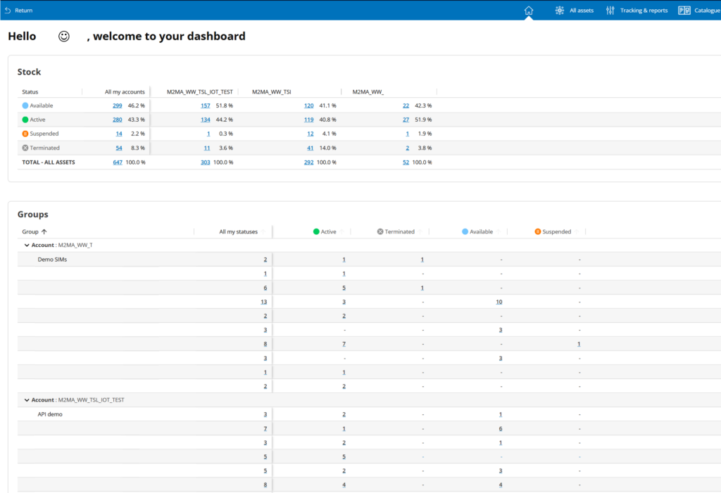
Once you have switched to table view, 2 tables will appear:
- a table summarizing the status of your SIMs
- a table below listing all the groups of your account(s)
Click on any number to access the related SIMs.
Can't find your answer?